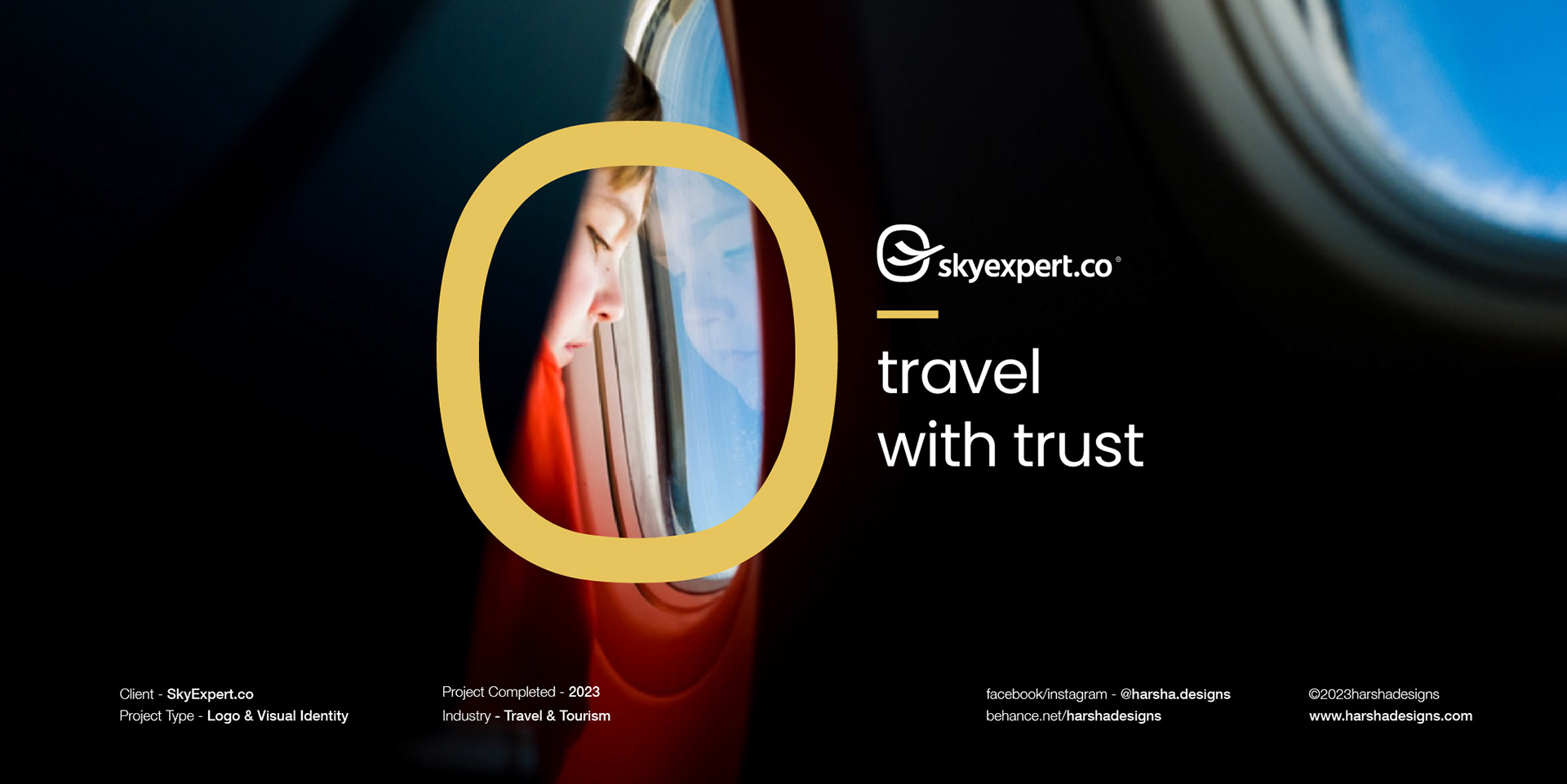
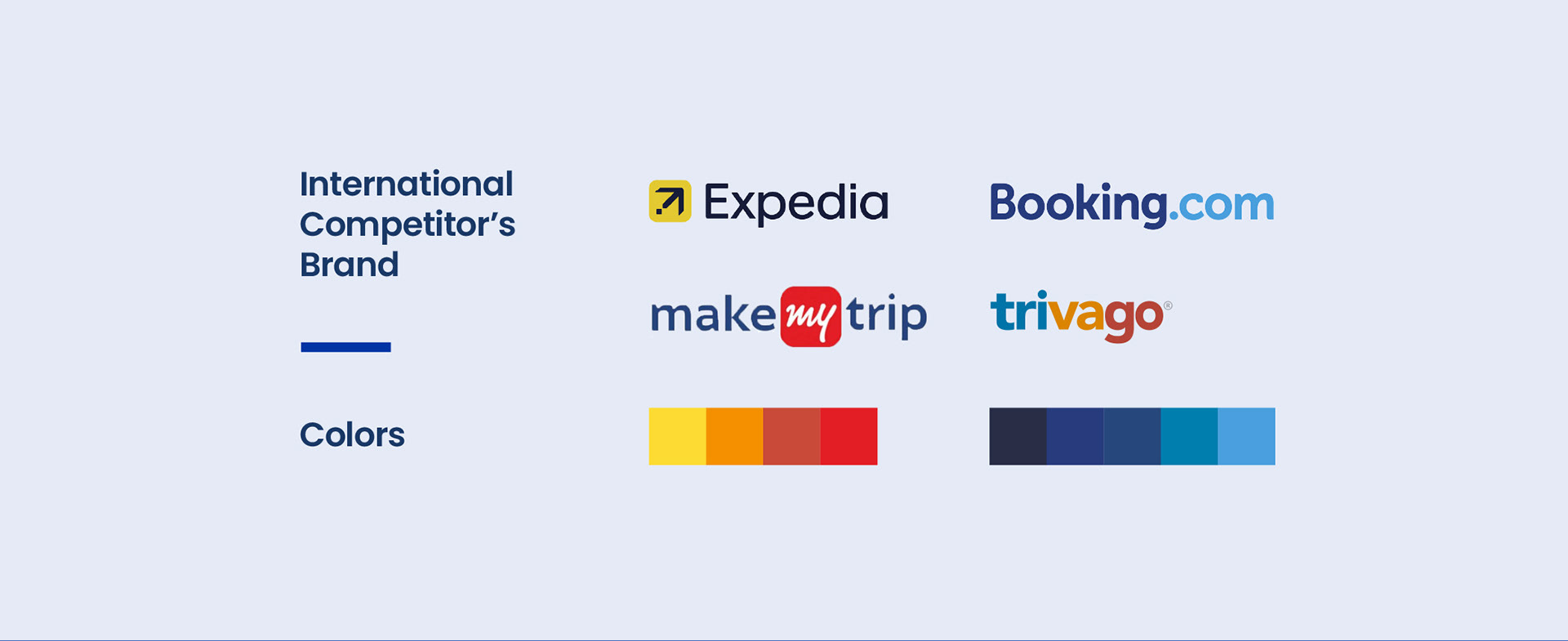
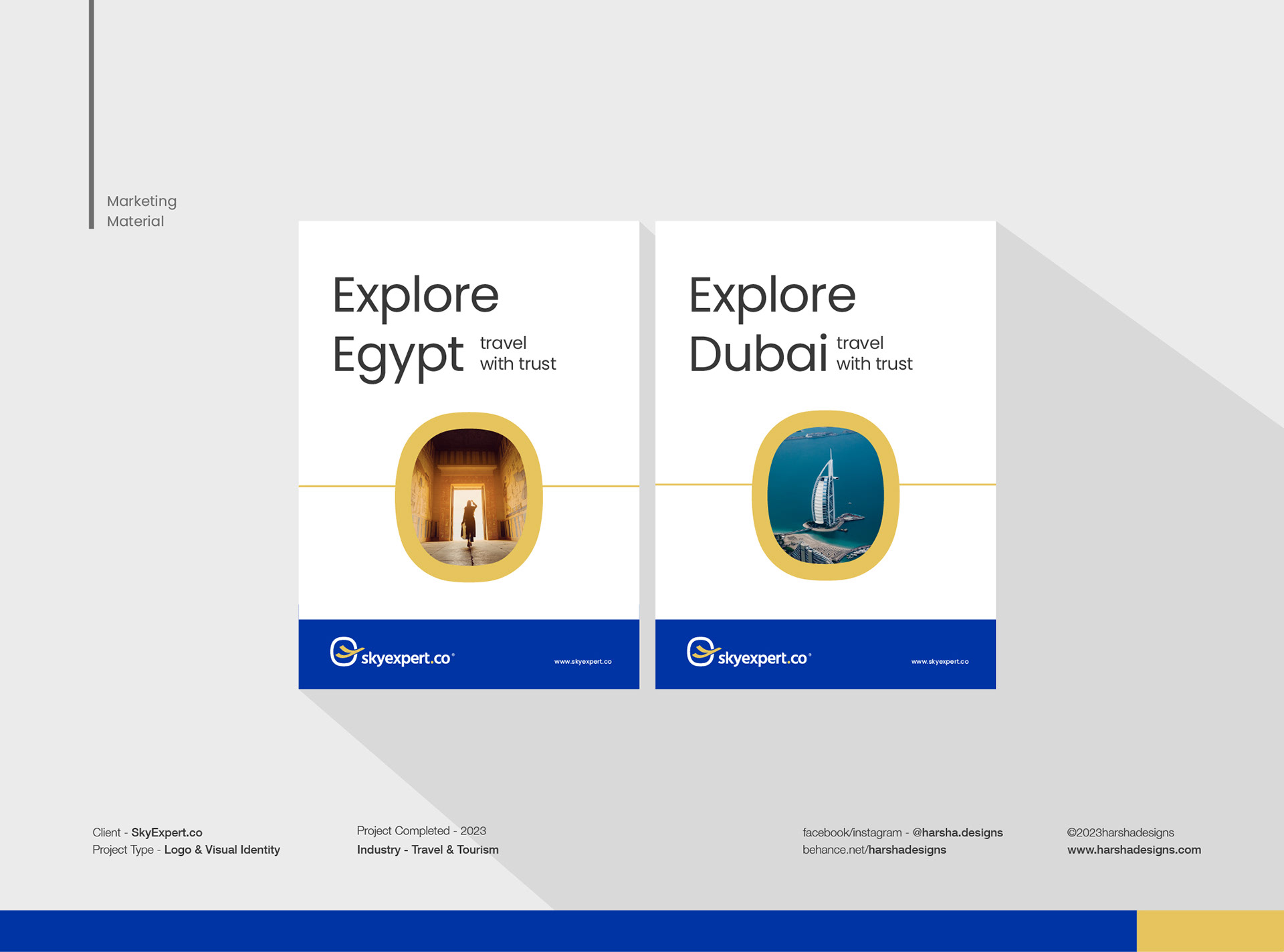
SkyExpert is an upcoming Online Travel Agent which provides services such as Air Tickets, Helicopter Charter, Private Jet Charter, and Cargo.
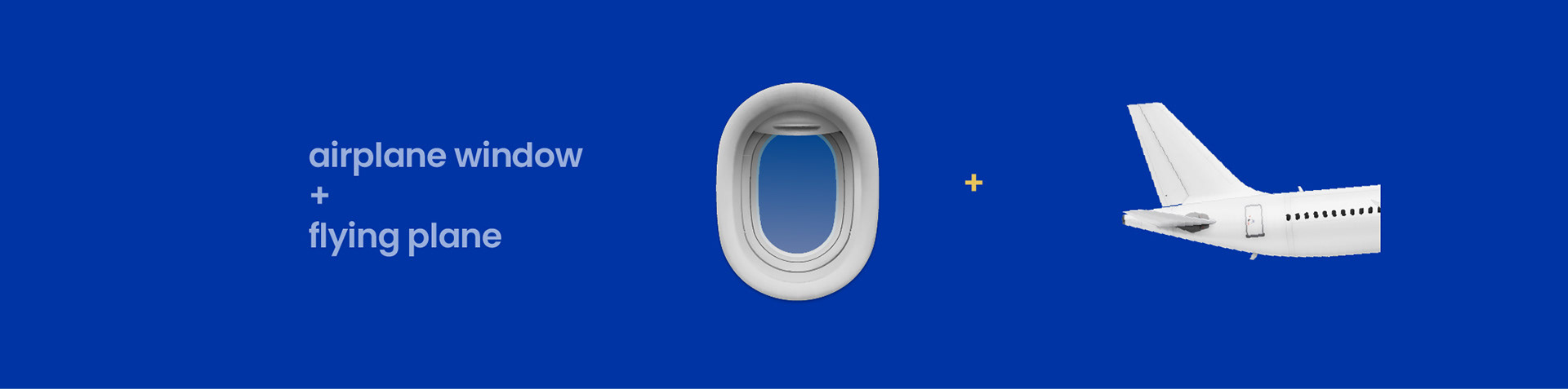
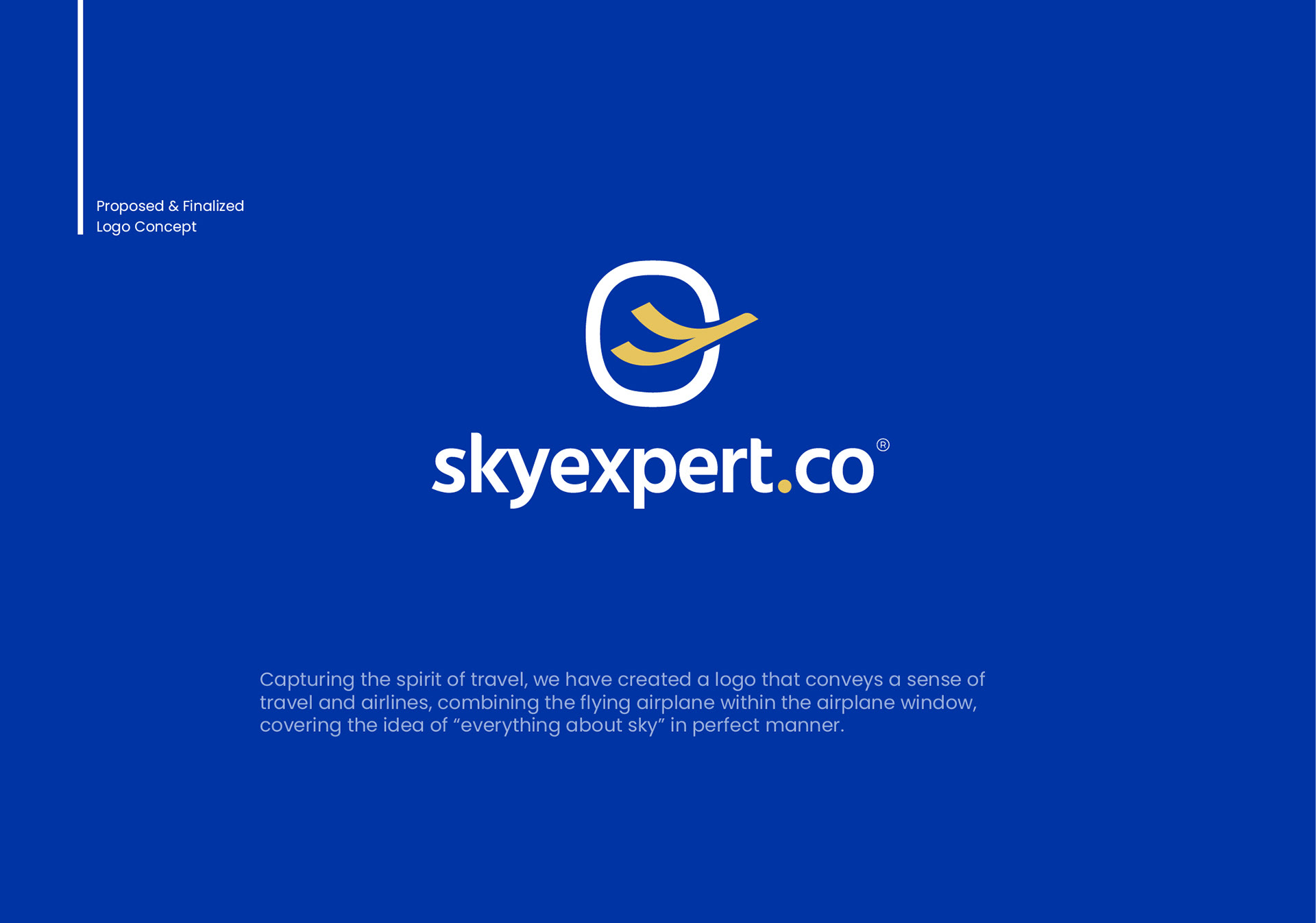
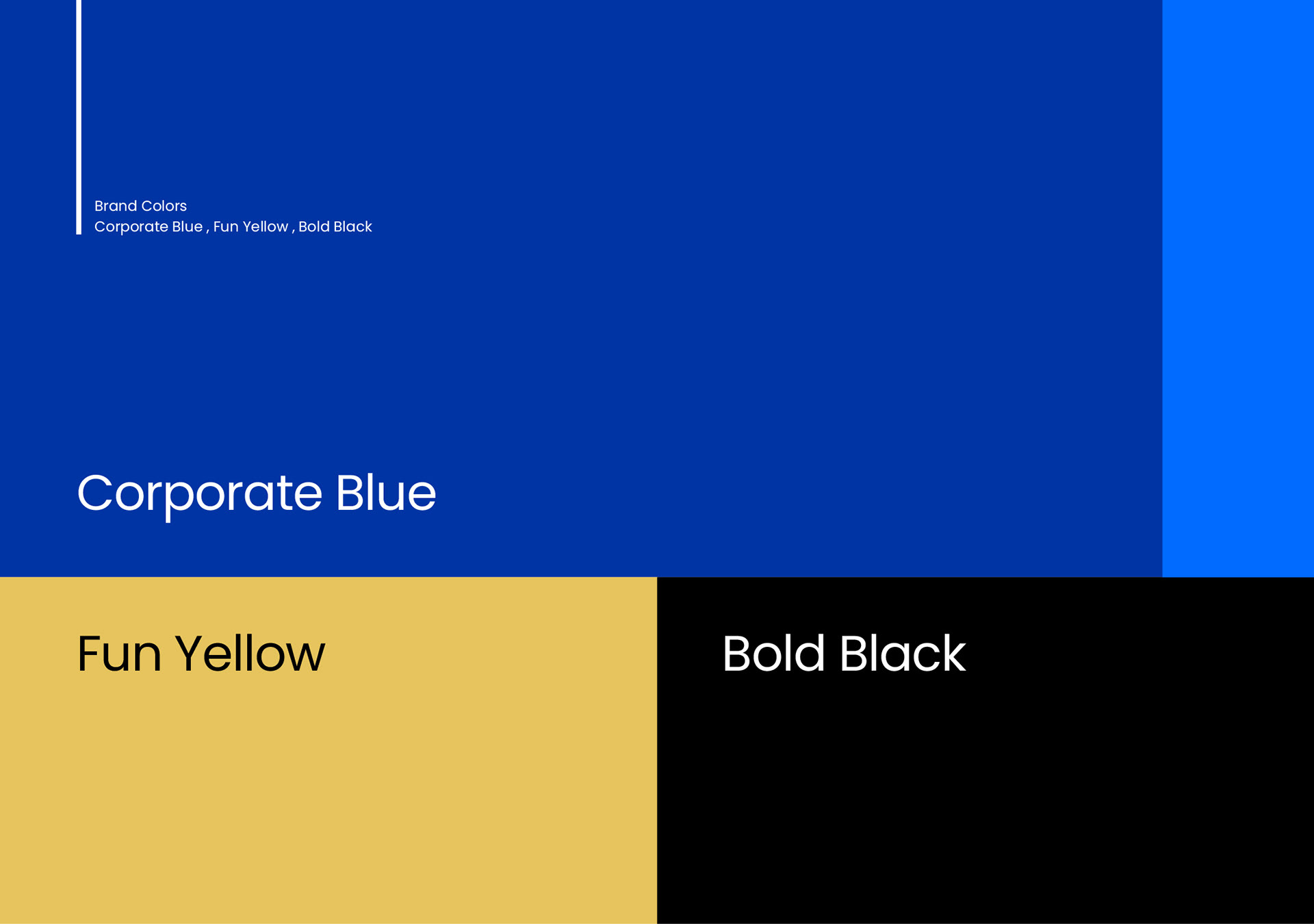
SkyExpert logo features a bold, stylized airplane combined within an airplane window . The mark symbolizes the agency's commitment to helping their customers navigate the world and discover new destinations. The use of color hues represents the corporate trust (blue) for the brand as well as fun (yellow) at the same time.
The typography is clean and modern, with a sans-serif font that conveys a sense of professionalism and reliability. The agency's name is featured prominently, with the word ".co" integrated within the logo to emphasize the agency's focus on helping customers plan and book their dream trips online simply and swiftly.
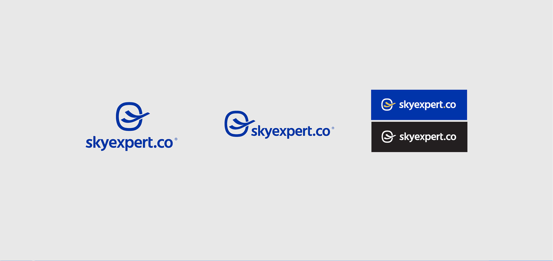
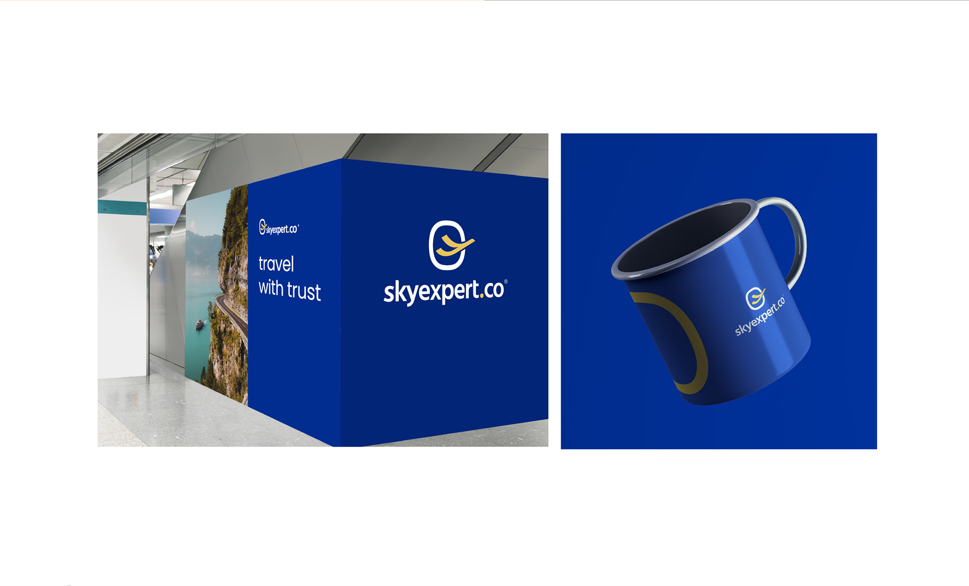
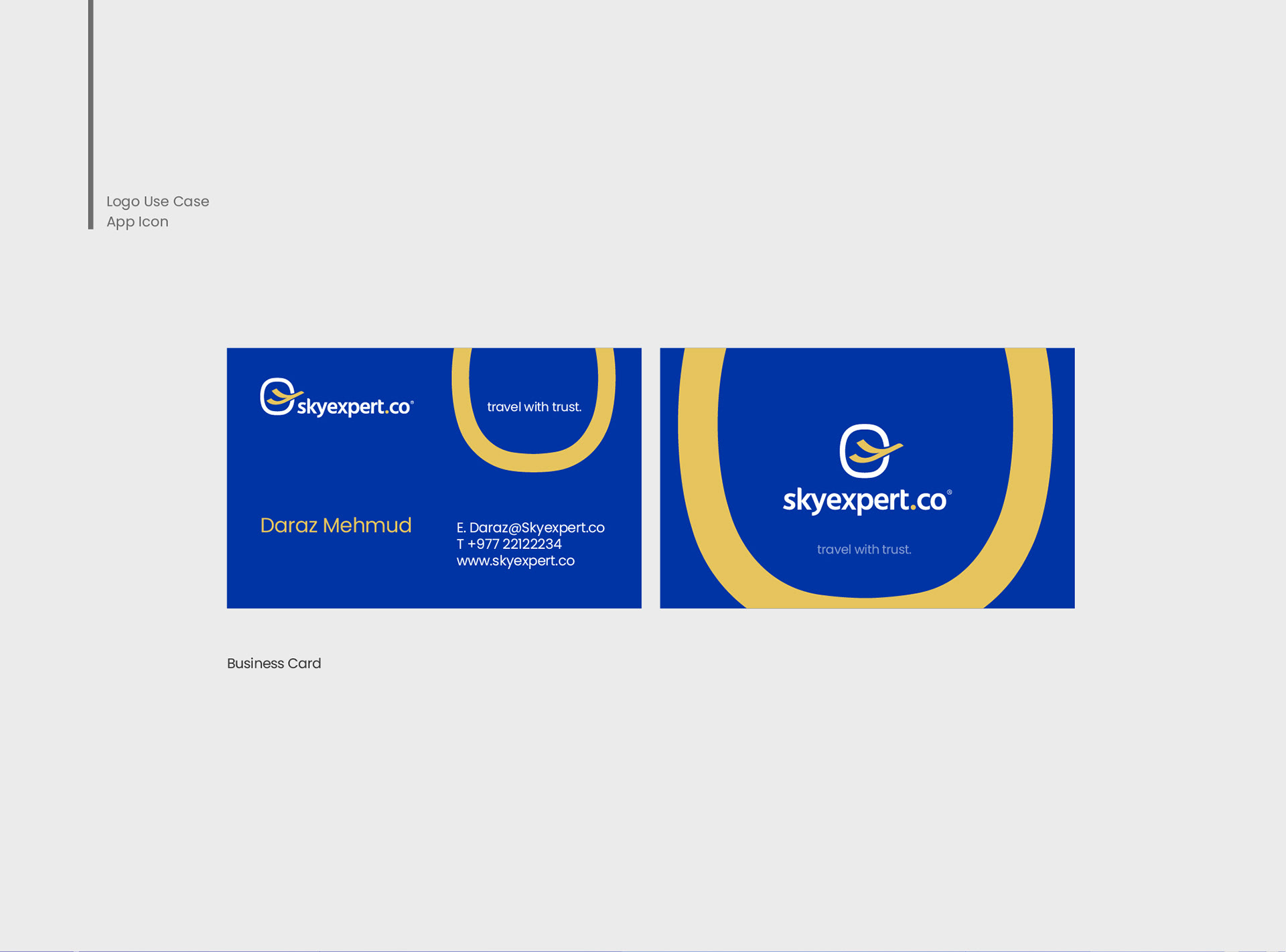
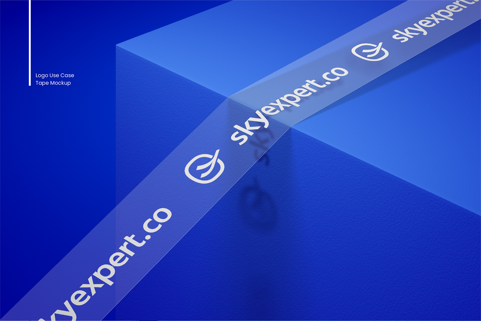
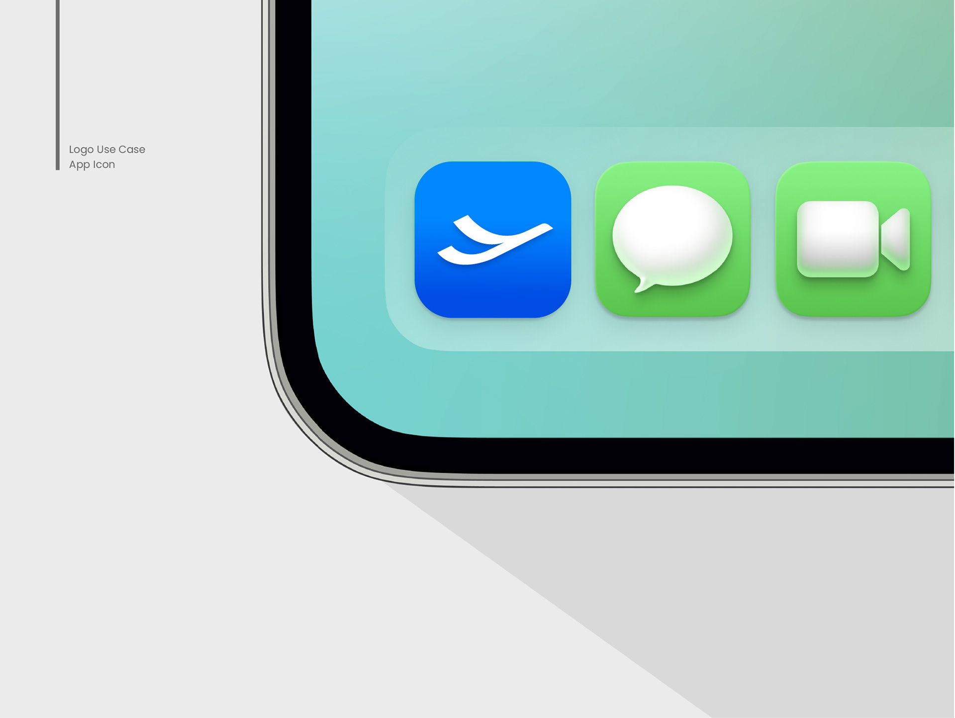
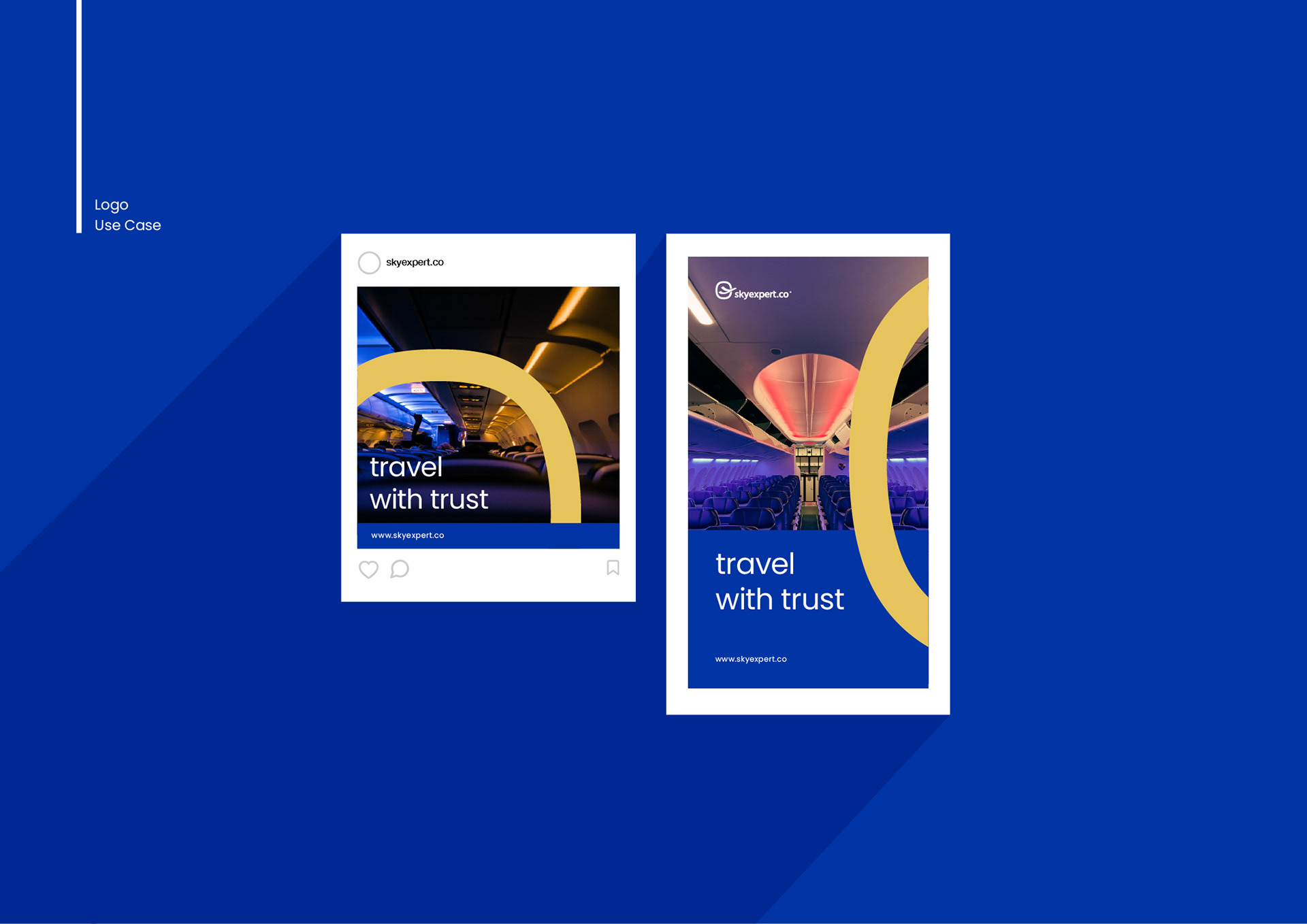
Overall, the logo is designed to be versatile and adaptable, easily recognizable across a range of mediums from business cards to social media profiles. It conveys a sense of adventure. trust, and expertise, inviting customers to embark on a journey of discovery with our agency.
__
Client - Sky Expert ® | Year - 2023 | Industry - Travel & Tourism / Cargo / Transport / Airlines
__

Thank you for your time !
___
We are a Visual Brand Design Studio with a decade-long experience in the field with working knowledge of various sectors and we believe in crafting quality visual designs that are functional as well. Our expertise is Visual Brand Design with a core in logo design, along with creating Brand Guidelines, Packaging Designs, Collateral Designs, Print and Promotional designs such as Advertisements, Brochures, and Flyers, as well as digital designs such as Social media, Web UI Designs, etc.
___
CREDITS
_
Creative Director - Sujesh Harsha Bajracharya
Creative Director - Sujesh Harsha Bajracharya
Project Type - Logo Design and Brand Identity
Deliverables - Logo Design, Collateral Design, Banners & Promotional Designs
_
CONNECT WITH US
_
Email . mail.harshadesigns@gmail.com |
Click below to Direct message :
©2023harshadesigns