Live Assist Company ®
LIve Assist is a Kathmandu-based Live Event Management startup that brings electrifying experiences to life. With a fresh team and a big vision, they wanted a brand identity that would resonate with a generation that lives for music, culture, and moments. They provides Event Management, Digital Marketing and Promotions, Graphic Designing, social media handling, content creation, event consultant, video and photography, etc.
LIve Assist is a Kathmandu-based Live Event Management startup that brings electrifying experiences to life. With a fresh team and a big vision, they wanted a brand identity that would resonate with a generation that lives for music, culture, and moments. They provides Event Management, Digital Marketing and Promotions, Graphic Designing, social media handling, content creation, event consultant, video and photography, etc.
Client: Live Assist Company
Industry: Live Event Management
Target Audience: Youth (18-30), college crowd, urban partygoers, festival lovers
Tone: Energetic, Bold, Urban, Inclusive
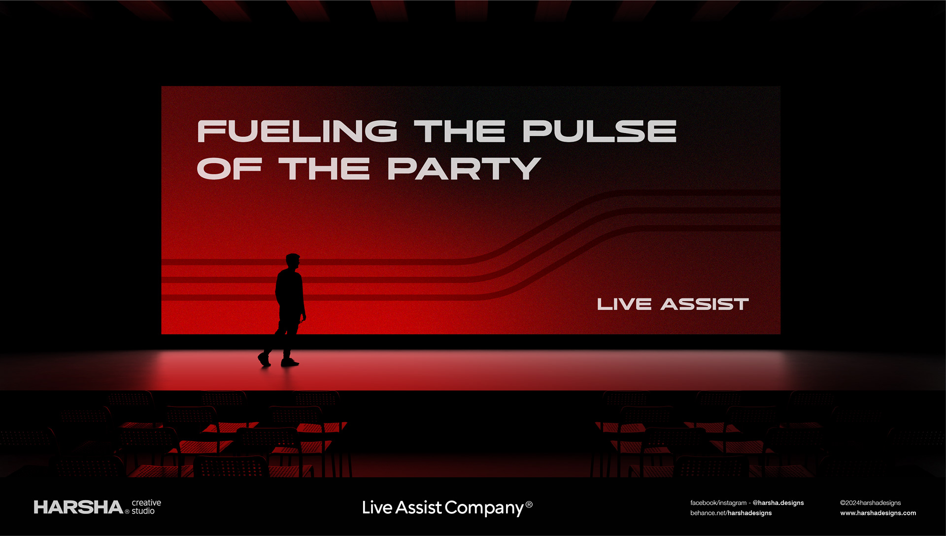
Services: Concerts, youth festivals, campus events, club gigs, influencer activations
Industry: Live Event Management
Target Audience: Youth (18-30), college crowd, urban partygoers, festival lovers
Tone: Energetic, Bold, Urban, Inclusive
Services: Concerts, youth festivals, campus events, club gigs, influencer activations
Challenge
To create a brand recognition in a saturated market of generic event planners which also Needed to appeal directly to GenZ and Millennials, who are highly visual and trend-aware. Create a cohesive identity that works across both digital and physical spaces Establish a bold yet flexible visual system for diverse event formats. Align the brand to be scalable for collaborations with artists, venues, and sponsors
To create a brand recognition in a saturated market of generic event planners which also Needed to appeal directly to GenZ and Millennials, who are highly visual and trend-aware. Create a cohesive identity that works across both digital and physical spaces Establish a bold yet flexible visual system for diverse event formats. Align the brand to be scalable for collaborations with artists, venues, and sponsors
Objectives
Develop a unique and youthful brand identity with standout visuals. Craft a brand that feels alive, with rhythm and
movement. Position LAC as a go-to name for unforgettable youth-centric events. Build brand recall through a memorable logo, tagline, and design system. Empower LAC to create a consistent and loud presence across platforms.
Brand Strategy
Brand Personality: Urban, bold, high-energy, dynamic, unapologetically youthful
Brand Voice: Conversational, fun, punchy, with event lingo and hype-driven tone
Positioning: Live Assist isn't just an event crew — it's a vibe-setter, a hype machine, and a community builder
Audience Archetype: The "Explorer" - those who seek excitement, freedom, and high-impact moments
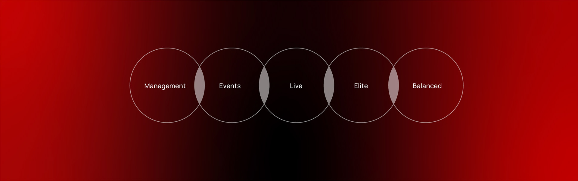
Brand Pillars:
Energy: Always in motion
Connection: Building real-life vibes
Experience: Every event is a story


Visual Solution
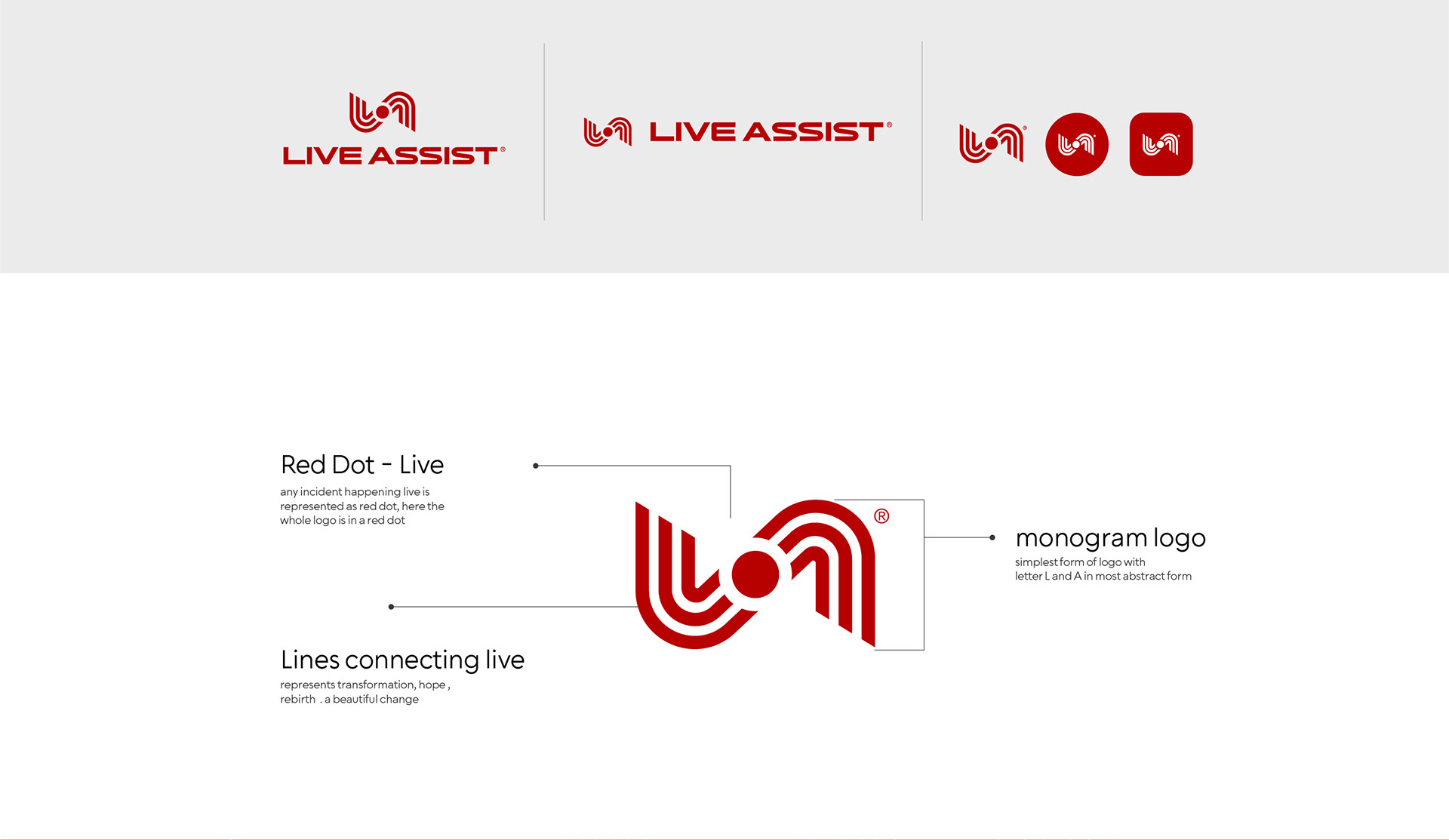
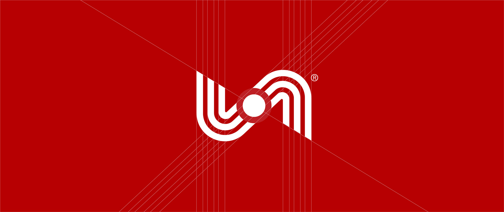
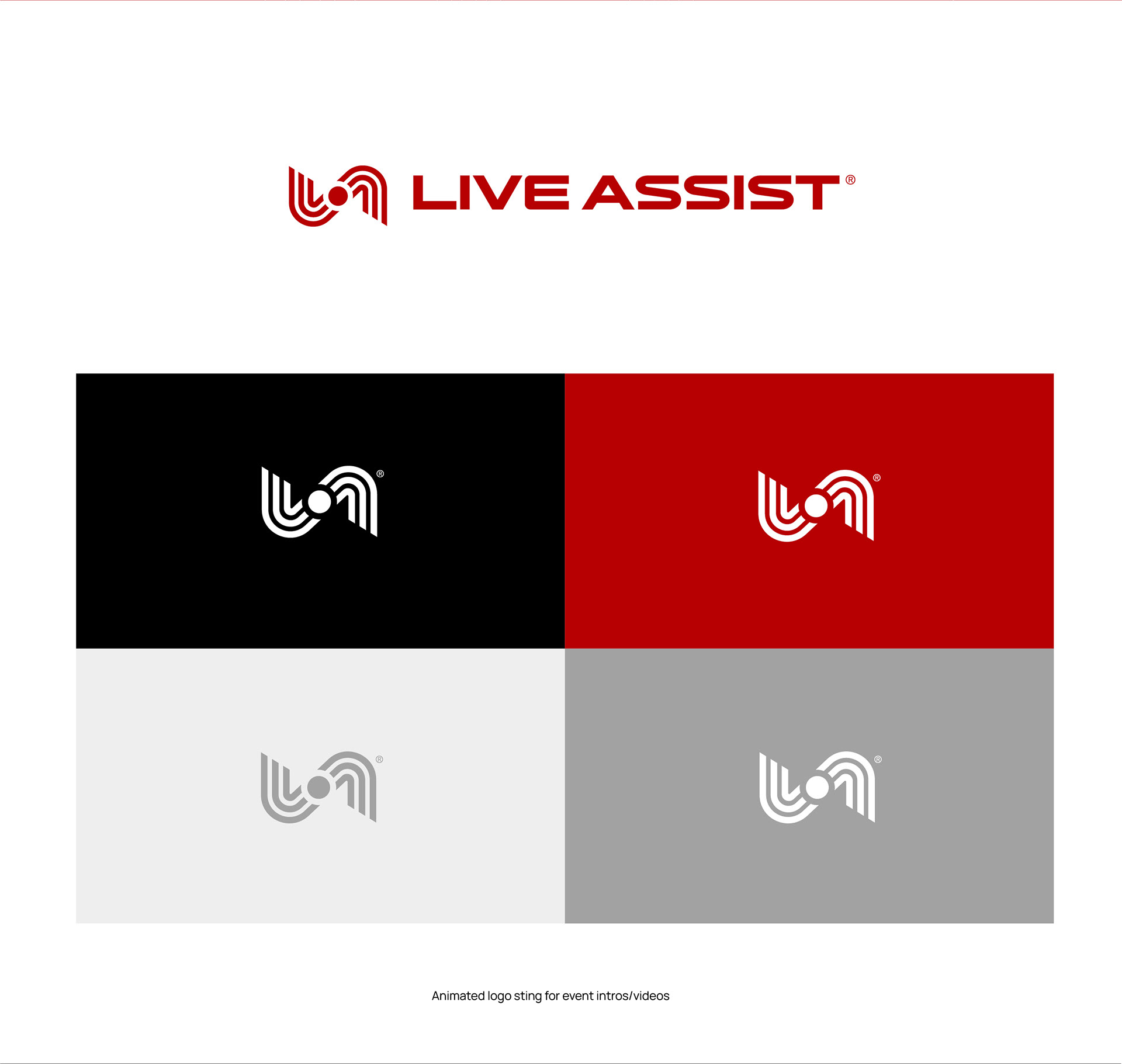
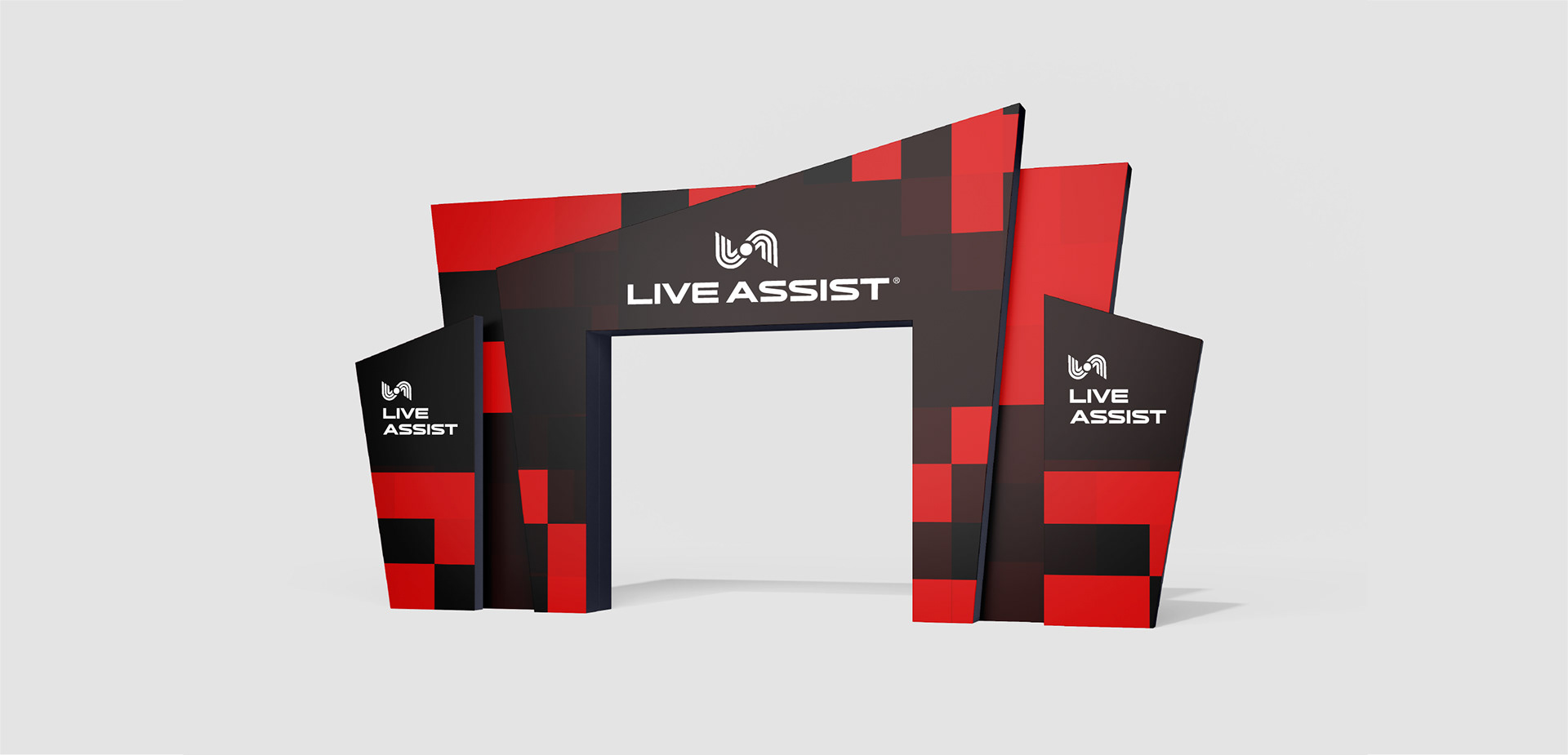
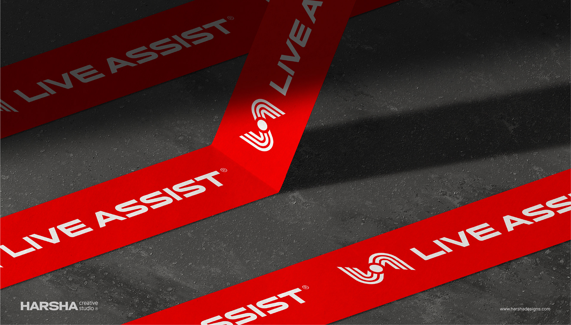
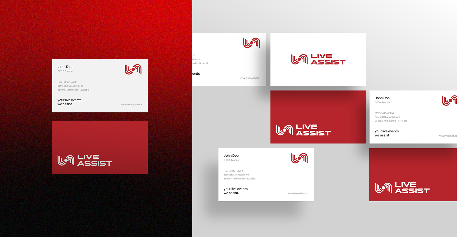
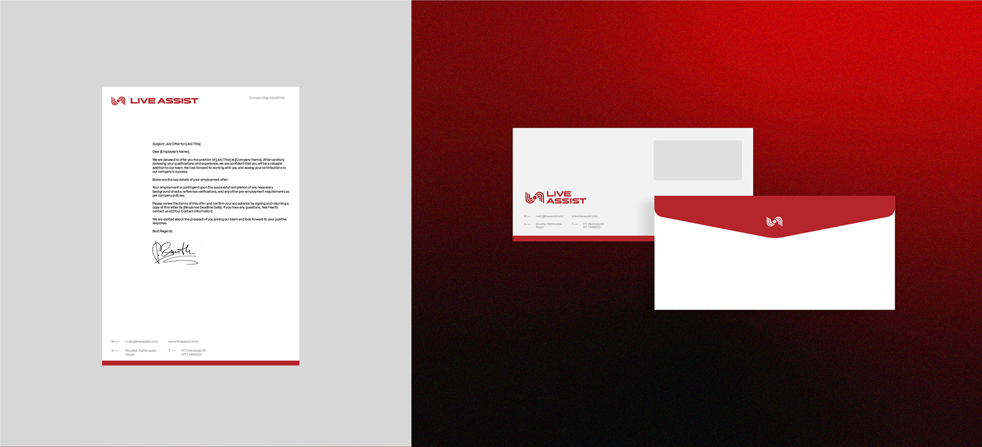
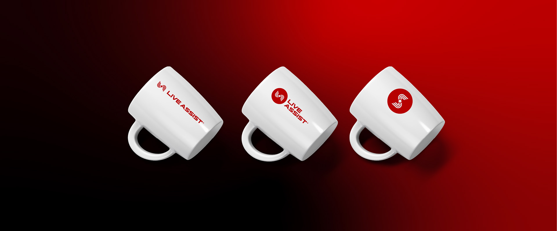
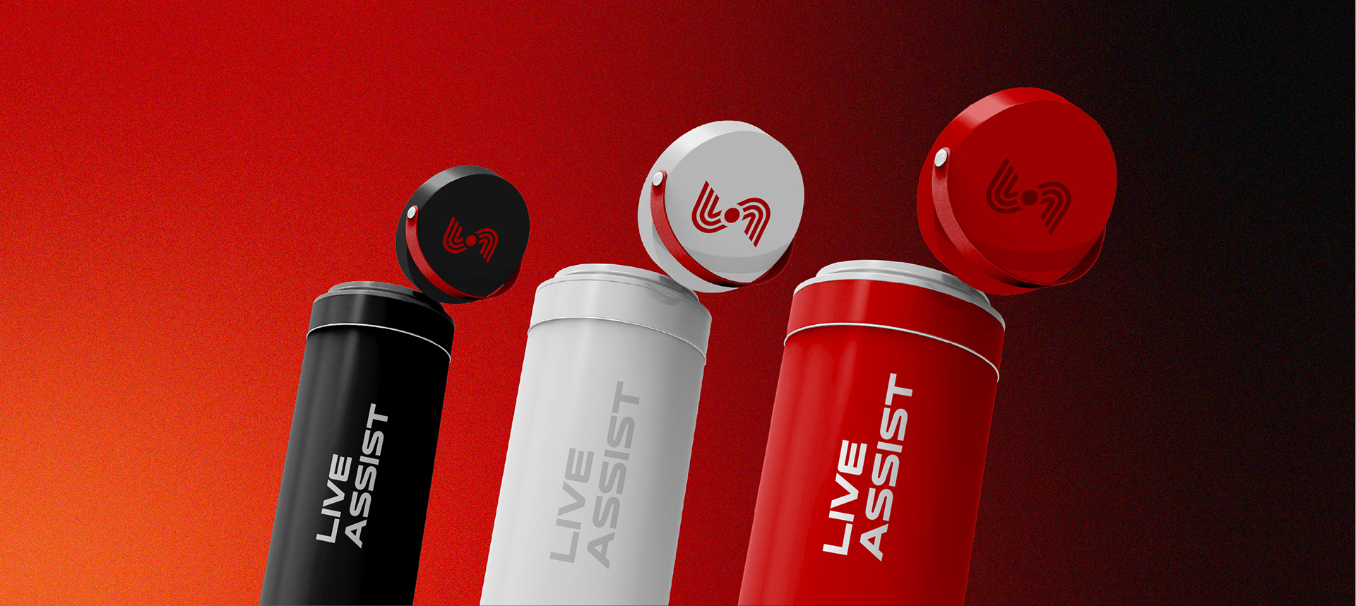
Concept: The logo is built around a dynamic monogram "LA", stylized as interconnected waveforms and geometric rhythm lines, symbolizing sound, movement, and unity. The center connection is the red dot that represents the live icon.
Concept: The logo is built around a dynamic monogram "LA", stylized as interconnected waveforms and geometric rhythm lines, symbolizing sound, movement, and unity. The center connection is the red dot that represents the live icon.
Visual Language
Motifs: Waveforms, spotlight gradients, grunge overlays, geometric grids
Photography Style : High contrast, motion blur, raw crowd moments
Motion Use : Dynamic transitions, sound-reactive visual cues, zooms and glitch effects
Motifs: Waveforms, spotlight gradients, grunge overlays, geometric grids
Photography Style : High contrast, motion blur, raw crowd moments
Motion Use : Dynamic transitions, sound-reactive visual cues, zooms and glitch effects
Results
3x increase in event engagement across social media within 2 months
Logo recall in over 60% of surveyed attendees at the first post-branding event
Higher sponsorship interest from music brands and local promoters
3x increase in event engagement across social media within 2 months
Logo recall in over 60% of surveyed attendees at the first post-branding event
Higher sponsorship interest from music brands and local promoters
Client Words
"We didn't want to look like every other event planner out there. What we got with this brand is pure fire. It's
like seeing our energy visualized. People vibe with it instantly and that's exactly the reaction we needed."
— The LAC Crew


Let's work together!
Connect with us
↓
mail.harshadesigns@gmail.com